Filed Under: closets, dressing rooms, wardrobe
I was doing my devotions today and I thought it was so good I wanted to repost it for everyone. How many of us have been guilty of this??
What's the Big Deal about Dwelling on the Past?
BY: Melanie Chitwood"Forget the former things; do not dwell on the past. See, I am doing a new thing!"A young married woman unloaded her marriage frustrations on a radio call-in show. Her husband had forgotten what the word romance meant. He never thought to bring her a sweet card or to plan a date. He didn't thank her or even notice her hard work, like laundry and keeping the house clean, along with working full-time.
Isaiah 43:18,19a (NIV)
I suspected her thoughts were leading her to a dangerous place. Sure enough, the young wife confirmed this with her next statement: After two years of marriage, she wondered if she'd made the right decision about this marriage. Maybe she should have married the guy she dated right after college, the one she regretted letting slip away from her.
Her fantasies of what might have been were leading her to a dangerous place of dwelling on the past. Thoughts of the past, or as today's Scripture puts it, "former things," can bombard our marriage mindset in damaging ways. See if any of these thoughts ring a bell:
- I wonder if I made the right decision about my marriage?
- I wish my husband were romantic (attentive or understanding) the way he was when we were dating.
- What happened to the great listener I used to have in my husband? Now all he wants to do is play sports or watch TV.
- Even though it was years ago, I just can't forgive the way he hurt my feelings.
- This isn't what I imagined marriage would be. What happened to all our dreams?
The young wife on the radio found the world's answer to her marital frustrations. The radio hostess agreed that this husband was clueless and this young wife should question staying in this marriage.
I wanted to scream, Stop right there! You're going down a dangerous path! Maybe he wasn't a good husband. But I suspect he was just a human husband, one with flaws and shortcomings. Just like the husband had plenty to learn about marriage, so did this young wife.
God has a better answer for what to do when we find ourselves dwelling on the past in a detrimental way. He says, "See, I am doing a new thing!" (Isaiah 43:19) In other words, God asks us to redirect our focus to the good things He can and will do in our marriages. As we continue in Isaiah we come to a question we need to ask ourselves, "Now it springs up; do you not perceive it?" (43:19).
God's is asking, Do you see the good things I'm doing right now... in your life or marriage? Pay attention or you're going to miss out!
To redirect our focus on the new things God is doing in our marriages, we can pray about our marriage mindset, asking God to help us see the blessings, not the drawbacks. We can choose to think about how our marriage has gotten better, and look forward to the future we have together.
Reading this devotion may have triggered thoughts of some unresolved issues in your marriage. This isn't meant to minimize the bigger issues you might be wrestling with in your marriage. These issues may need to be resolved before you can move forward. Pray about it individually and as a couple, talk with your spouse, and seek godly counsel. These steps might be necessary before you can see God "making a way in the desert" (Isaiah 43:19).
Dear Lord, You make all things new. Will You give me new eyes to see the good things I sometimes miss? Help me not to dwell on the past but to focus on the present and future. You are making a way, Lord, and I trust You with my heart, my husband and my marriage. Help us deal with any issues that are damaging our relationship, so we can appreciate the new things You're doing. In Jesus' Name, Amen.
Filed Under:
Here are some pictures that have inspired me to at least start dreaming about it...hope they inspire you too.
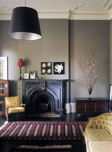
I love the moody grey wall in this one, combined with the purple and mustard yellow. (via carolinaeclectic.blogspot.com)
The steel blue and yellow details give this room a nice modern feel (via Houzz)
More happy than moody, I really like the feel of this living room. Great combination of retro furniture and bright colours. And hey, great purpose of a granny blanket too! :-) (via Houzz)
Wow. These are BOLD colours. I don't think anyone could be moody in this room. Wonderful mix of fabrics. (via Houzz)
This is a seriously moody room. Love the dark blue velvet on the chair. (via Houzz)
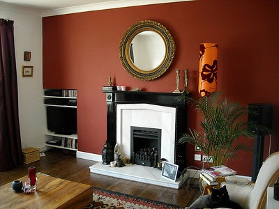
And this is...my own livingroom! Quite a bold colour scheme as well. I do still like the spicy red colour of the wall in combination with the glossy black fire place, baroque mirror and the orange lamp, especially at night when it makes to room feel very cozy. Maybe I will leave it for another year...
Do you have a feature wall or bold colour scheme in your house or great example on your own blog? Please share in the comments section. I'd love to see more inspirational photos. Nina x
Filed Under: home decor
Filed Under: fairly lights, outdoor, tables, weddings
Filed Under: antlers, beer crates, bookshel, castor wheels, interior design
here is some more innovative use or crates and pallets. love the overall look and interiors of these places
Filed Under: daybeds, interior design, pallet
one of the things i want for our new house is a coffee table made from an old wine pallet. i spotted this idea in a prodesign magazine so googled it and found all sorts of treats
the glass idea is nice so you can display things under it but i think i prefer the all over wooden slat look
Filed Under: coffee table, Interior, pallet
after sitting on the couch for the last few hours setting up my blog I am now going to say good night. i also have freezing cold toes. tomorrow is the start of up-loading and categorising my image library on here. i just want to buy old wooden furniture and paint it white!
good night friend...and please let me toast my feet on your legs
also i am v excited to download the blog app to my iphone to enable me to post words and pictures from there!
x
Filed Under:
What a way to spend a Saturday night! A blog is something I have been meaning to do for a while yet have kept putting it off. We are now moving into a new flat and I keep finding fantastic and innovative ideas for creating distinct and modern furniture that can be made by yourself for a low cost. I want to remember all the fantatsic ideas I see and research so eventually I can begin to design and make (and then share) what I want for my personal space. So many ideas!
This is also a great space to share, borrow and be inspired by many creative and clever people on the www!
enjoy
Filed Under:
studio pei zhu: yi garden at venice architecture biennale 2010
'yi garden' by pei zhu at the 12th international architecture biennale in venice, italy
image © designboom
as a part of the chinese pavilion at this year's venice architecture biennale, studio pei zhu has designed
and constructed an outdoor installation which aims to reinterpret, explore and expand on the traditional
chinese garden and notions of space through contemporary and futuristic methods.
located in a courtyard outside of the old arsenale building,
'yi garden' is comprised of more than 1300 acrylic bars of varying heights, arranged in a grid system on
the lawn. when viewed from afar, the sanded, luminous tips of the bars come together to create a cloud-like
form that seems to float above the ground. the pavilion also creates loose spaces or zones which promote
movement for those who physically enter and interact with the bars.
front view
image © designboom
traditional chinese landscape, much like chinese painting and calligraphy, works in softness that is both tangible
and conceptual. it often obscures the horizon by avoiding straight lines in paths and exclusively uses organic
and geological forms. the character 'yi' literally translates to 'meaning, idea or desire' but its associations include
both the concept that precedes actualization, the move from the concrete to the abstract, and invisible over visible structure.
by using the language of modern materials and abstractions, the installation blurs the edges of form and space,
creating tension between the indistinct and distinct, ultimately become a prop in the process of form-engaging
rather than serve it's role as an object in itself.
acrylic bars arranged in a grid system
image © designboom
varying heights and opacities of the pavilion
image © designboom
detail
image © designboom
image © designboom
image © designboom
rendering
image courtesy studio pei zhu
image courtesy studio pei zhu
diagrammatic drawing of the 'cloud' form
image courtesy studio pei zhu
calligraphy
one feature of chinese classical gardens is to ensure a spiritual flow behind the visible structures. there is a 'shi' (trend) behind the
appearing relaxed and dispersed structures. it in general controls the routes, the structure and display of each site, which has some
similarities as chinese calligraphy. there is also certain 'shi' that dominants the flow or stop of each strike when people do chinese calligraphy.
side elevation, lit
image courtesy studio pei zhu
perspective, lit
image courtesy studio pei zhu
vignette of 'cloud' form
image courtesy studio pei zhu
clouds
'corridors, bridges, kiosks and pavilions are the main elements embodied
in traditional chinese landscape gardening. these elements give people a relaxed and transparent feeling.
normally the roof parts are connected to each other, which create diverse and hierarchical spaces.' -studio pei zhu
the acrylic bars lit up at night
image courtesy studio pei zhu
interlaced thought
'our work is predominantly located in china and influenced by the chinese experience. this ancient civilization maintains an intense
and powerful presence in the built environment and collective cultural scheme. our efforts are an attachment and detachment to this
scheme that attempt to engage the chinese viewer in a dialogue about the shifts in their own cultural identity.
vast cultural experiences determine the method of understanding and engaging the language of architecture. new buildings are built
next to old buildings built in ancient spaces built at mythic happenings. in chinese philosophy art is not the final goal; art is a process
to personal refinement and growth. our work reflects this immense cultural presence while using contemporary techniques and
materials to rethink the cultural approach to architecture.
currently there is a conflict between the modernization trend and the traditional course of life. this modernization progression has led
to mass materialization that disconnects the spirit and self. the process of experiencing art through architecture can refine and inspire
the human spirit, alleviating the physical invasion and restoring balance to the self. art is the immaterial content of space that stirs the
heart and sparks humanity's dreams. instead of being too eager to occupy space, we need to return buildings to nature when they are
not in use. the buildings melt into the context and reappear when they are needed. the challenge of foresight is in building projects that
connect to the traditional identity while effectively gesturing towards this future utopia.' -studio pei zhu
sketch
image courtesy studio pei zhu
credits
artist / architect: pei zhu / studio pei zhu
artistic consultants: fan di'an, wang mingxian, zhu xiaodi
lighting artistic consultant: xiao lihe
structure consultant: rory mcgowan
construction consultant: zheng jianwei
design team: he fan, liu wentian, heonju seo, kejun, geoffery hughes
esan rahmani + mukul damle: bamboo pavilion
'bamboo pavillion' by esan rahmani and mukul damle
all images courtesy esan rahmani
australian designer esan rahmani together with mukul damle have designed 'bamboo pavilion'
a synthesis of sustainable ideas for a communal shelter for disadvantaged populations around
the indian ocean rim.
bamboo is already used in asia and pacific regions as a building material due to its adaptable
qualities to make roofing, flooring, water and drainage pipes and be used as structural members.
using smart joinery and efficient use of bamboo, there is no need for the use of other materials
to construct the shelter. the structural members also act as a system of interconnected pipes
(bamboo) which collect and channel the rain water into a central basin where it is filtered
and stored for use.
the shelter is designed with quality of life in mind. solar access is therefore the central focus of
the communal living area, where it is maximized by a radial funnel shaped opening in the structure
and in sleeping areas operable shades allow light in, provide natural ventilation. the roof is tiled
using quarter cuts of bamboo similar to traditional terracotta tiles. in plan the design allows for
a large communal living space surrounded by bedrooms and amenities.
exploded view of the 'bamboo pavilion'
floor plan
croatia's floating pavilion for venice architecture biennale
croatia's 'floating pavilion' for the 12th international architecture biennale in venice, italy
image courtesy pavilion.hr
photo by zelimir grzancic
for the event of this year's venice architecture biennale, croatia has designed
and built a floating pavilion on an existing barge to be tugged by a tow boat
to the site of the international event. constructed out of 32 tons of steel,
the structure's form is defined by a methodical system consisting of over 40 layers
of welded Q385 wire mesh. each layer contours at varying depths and lengths
to create a carved out space which plays with different transparencies, densities,
and vision lines. despite the solid and heavy materials, the resulting effect is
a blurring of form;at a distance, the pavilion conveys elements of fragility and lightness.
the project is a collaborative effort by 14 croatian architects and members
of the local maritime industry.
however, despite the relatively short journey from croatia to venice,
the pavilion experienced structural problems and never made it to the italian site.
in phase of collapse
image courtesy katarina olujic
image by robert les
image courtesy katarina olujic
image courtesy katarina olujic
completed form, before leaving for venice
image courtesy pavilion.hr
interior view
image courtesy pavilion.hr
night view
image courtesy pavilion.hr
shots of the pavilion at the rijeka port in croatia
images courtesy pavilion.hr
the floating pavilion sailing for venice
image courtesy pavilion.hr
photo by zelimir grzancic
project credit:
commissioner: leo modrčin
architects: saša begović, marko dabrović, igor franić, tanja grozdanić,
petar mišković, silvije novak, veljko oluić, helena paver njirić, lea pelivan,
toma plejić, goran rako, saša randić, idis turato, pero vuković, tonči zarnić
maritime consultant: miljenko gržalja
structural engineer: zvonimir sabljak
naval architecture: nicola ferrari
principal contractor: an.ta.so.mont
Filed Under: Venice Bianale 2010









.JPG)


