Showing posts with label concept. Show all posts

Caddis fly larvae build protective cases using materials found in their environment. French artist Hubert Duprat supplied them with gold leaf and precious stones including opal and turquoise. This is what they created. They are beautifully gross or disgustingly beautiful depending on how you see it. Interesting to see the patterns and combinations created by nature.


The images above illustrate the results of an unusual artistic collaboration between the French artist Hubert Duprat and a group of caddis fly larvae. A small winged insect belonging to the order Trichoptera and closely related to the butterfly, caddis flies live near streams and ponds and produce aquatic larvae that protect their developing bodies by manufacturing shea­ths, or cases, spun from silk and incorporating substances—grains of sand, particles of mineral or plant material, bits of fish bone or crustacean shell—readily available in their benthic ecosystem. The larvae are remarkably adaptable: if other suitable materials are introduced into their environment, they will often incorporate those as well. 
Duprat, who was born in 1957, began working with caddis fly larvae in the early 1980s. An avid naturalist since childhood, he was aware of the caddis fly in its role as a favored bait for trout fishermen, but his idea for the project depicted here began, he has said, after observing prospectors panning for gold in the Ariège river in southwestern France. After collecting the larvae from their normal environments, he relocates them to his studio where he gently removes their own natural cases and then places them in aquaria that he fills with alternative materials from which they can begin to recreate their protective sheaths. He began with only gold spangles but has since also added the kinds of semi-precious and precious stones (including turquoise, opals, lapis lazuli and coral, as well as pearls, rubies, sapphires, and diamonds) seen here. The insects do not always incorporate all the available materials into their case designs, and certain larvae, Duprat notes, seem to have better facility with some materials than with others. Additionally, cases built by one insect and then discarded when it evolves into its fly state are sometimes recovered by other larvae, who may repurpose it by adding to or altering its size and form.  
Via Cabinet Magazine 

Continue..

Filed Under: , , ,


This fantastically simple christmas lights packaging was conceived in 2011 by student Audrey Wells. The Packaging itself can be used as a tree, very modern and minimal, but also to store away the lights until next season, and can be hung in a closet or at POS. Screenprinted in one colour on cardboard, using only whats neccessary, could this be more eco and chic at the same time?!

Via Packaging Uqam.

Continue..

Filed Under: , , ,


How many times have you wished the cord was just a little bit longer? Meysam Movahedi has obviously wished it enough times to consider solving the problem through clever design. Movahedi created and intelligent alternative of the traditional extension cords, which practically eliminates the need for them.
The Rambler Socket is an electrical socket with a built in 1.5 m (59 inch) long extension cord hidden in the wall. You can simply pull it out whenever you need it – in any length that you need. When it’s out, a gentle tug will activate retraction mechanism and the cord will hide itself back in the wall.

Via Designose

Continue..

Filed Under: , , ,


'Anama, a contemporary wine concept, is the result of an inspiring partnership between oenologist Lefteris Mohianakis and Cypriot jewellery designer Kristina Apostolou. Together, both artists aspire to produce a refined Authentic Cypriot Product, based on the timeless traditions and heritage of their culture.
'Anama 2007, released in December 2009. A Total of 723 hand-numbered bottles with a sterling silver handcrafted label, is the first 'Anama harvest to be launched into the market.

'Anama 2009, a composition of 1,512 numbered bottles. The label is designed and hand-crafted in Cypriot oak, oxidised sterling silver, indian garnets & sealed in natural beeswax.
Above is a custom made bottle of 'Anama 2009, following a special order for a wedding gift. Materials used for label : Cypriot oak, sterling silver, oxidized sterling silver, precious tourmaline cabochon stone in sterling silver bezel. The hand-punched number signifies the wedding date of the couple is was given to.

Continue..

Filed Under: , , , , , ,


This is a beautiful examples of concept meeting brand communication. As the name of the brand suggests, Trip Tea's packaging and illustrations portrays the tea's origin, all landscapes are handmade directly from the tea variety in the package. This conveys an exotic image of the country as well as the richness of flavors and nuances of the product itself. Every sides of the package has one of the landscape of the triptych, that let you an opportunity to present the product at the point of sale in interesting and unusual way.

Designed by Andrew Gorkovenko via The Dieline.


Continue..

Filed Under: , ,


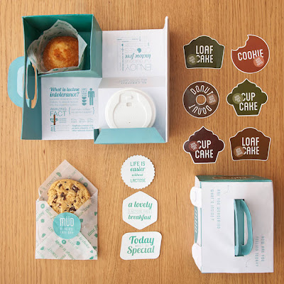
Another great student project, this time by Beatrice Menis & Mara Rodríguez both students of Elisava, Barcelona. Concept brand, Müd, offer lactose free cupcakes, donuts, cookies and loaf cakes which you can combine with coffee, tea or hot chocolate in little combo packs. Effortlessly cool and stylish, with a 'small bakery' feel using hand applied stickers.
Via Dieline

Continue..

Filed Under: , , ,


Recent graduate Liz Linn's concept gym for real men with a nautical twist. I could actually see something like this working, in a cross-fit workout style. I love the rough finish which really reminds me of a shipping dock, and the nautical style graphics. The minimal colour palette, photography style and fuss-free slogans are very masculine. A great concept that could be a great new niche market gym. See Liz's portfolio here.

Continue..

Filed Under: , ,


Centauro is a concept sport store in Sao Paolo designed by AUM Arquitetos. The idea revolves around a race track which is a strong graphic and recognizable element. The red track spreads through the store moving from the lower to upper floor, becoming the staircase, counter and lining the floor, ceiling and walls, acting as a corporate identification element of the brand. Sexy, glossy and graphic!

Continue..

Filed Under: , , , , ,


What a great idea! A laundry with a coffee shop and t-shirt store. You may as well drink coffee and browse the shirts while waiting for your clothes to wash and dry. A great way to capitalize on the 30 - 50 minutes someone spends in the laundry doing nothing.  The logo type and name comes from 30°C - the best temperature to wash clothes in, but in this case C stands for coffee. All the branding follows the graphics and icons used on clothing care labels, in my opinion it does still need a bit more work and refining, but overall a great concept. Project by Ekaterina Leontyeva from Paris.
Mood board

Continue..

Filed Under: , , , ,

AD

Related Posts Plugin for WordPress, Blogger...