Showing posts with label retail. Show all posts

One of my favourite studios, Stockholm Design Lab gives the brand ID of a Swedish pharmacy chain a big old happy pill. Using bright colours and bold anatomical illustrations as opposed to the predictive antiseptic clinical look. Instead, the Swedish pharmacy chain Vårdapoteket uses vivid jewel colors and cartoonish illustrations of the human body to create a lively look for the various bags, promotional signage, information leaflets, and wallpaper at its 24 stores.

Vårdapoteket is unique among pharmacies in that it’s located solely in hospitals and care settings and doubles as a grocery store. The pop of colour in an otherwise barren and uninspiring environment (hospitals) might be just what the doctor ordered for a sick person. Research has shown that positive environmental factors can reduce patients’ anxiety and even contribute to their overall well-being. SDL’s design, then, offers a small glimpse of cheer in an all-too-often stressful setting.

(via Fast co design)

Continue..

Filed Under: , ,


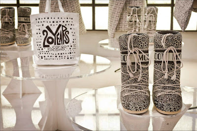
 Just back from a short break in Milan, my beau took me into a small hidden store in the Brera area, tucked away in the leafy inner courtyard on the Corso Como walk, is the multi-funcional space consisting of a retail store, cafe, 3-suite hotel, gallery and bookshop. Founded 21 years ago in Sept 1991 by gallerist and publisher Carla Sozzani, 10 Corso Como is on every highlight list of places to shop in Milan. It's best for luxury brands: Marni, Lanvin, Prada, more. Special one-of-a-kind pieces and exclusive collections designed exclusively for 10 Corso Como. Vogue Italia’s Editor-in-Chief Franca Sozzani selects most of the products herself! There is also a 10 Corso Como Outlet in Via Tazzoli 3, open Wed-Sat where you will find off-season items mix with one-of-a-kind statement pieces at a more affordable price.

Continue..

Filed Under: , , , , ,


Centauro is a concept sport store in Sao Paolo designed by AUM Arquitetos. The idea revolves around a race track which is a strong graphic and recognizable element. The red track spreads through the store moving from the lower to upper floor, becoming the staircase, counter and lining the floor, ceiling and walls, acting as a corporate identification element of the brand. Sexy, glossy and graphic!

Continue..

Filed Under: , , , , ,


What a great idea! A laundry with a coffee shop and t-shirt store. You may as well drink coffee and browse the shirts while waiting for your clothes to wash and dry. A great way to capitalize on the 30 - 50 minutes someone spends in the laundry doing nothing.  The logo type and name comes from 30°C - the best temperature to wash clothes in, but in this case C stands for coffee. All the branding follows the graphics and icons used on clothing care labels, in my opinion it does still need a bit more work and refining, but overall a great concept. Project by Ekaterina Leontyeva from Paris.
Mood board

Continue..

Filed Under: , , , ,


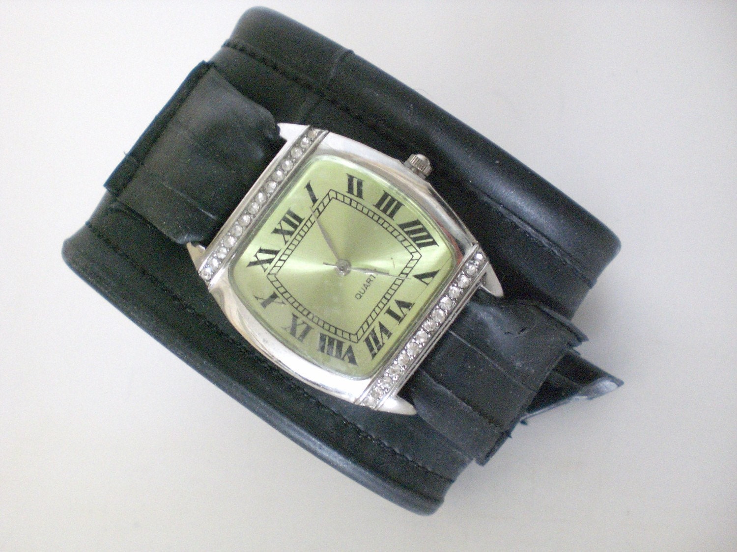
Check out my latest little review on the bike tube wrist watch from Momo Pics. This girl is so nice. I think that makes us online friends:


http://momopics.wordpress.com/2011/05/13/friday-feature-7/


Continue..

Filed Under: , , , , , , , , , , , , , , , , ,

AD

Related Posts Plugin for WordPress, Blogger...